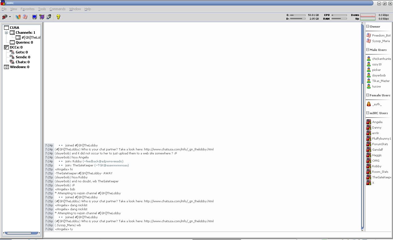
this is what i've been working on lately:
as it's chatsusa i went for an american mirc icon
Angelia,
I like it! Looking good. 
- Compu
A TG007 community discussion started by Ozzy10.

this is what i've been working on lately:
as it's chatsusa i went for an american mirc icon
Angelia,
I like it! Looking good.
- Compu
Indeed. I Like it. Ilike it alot!! 
PS - for anyone who may (or may not) of noticed I have not been online for some time due to some personal issues. I hope to have them resolved soon 
Get the Tech outta here!
This is a work in progress. There's still loads of bugs to iron out but it's my personal script 
People are like slinkies; they're generally boring until you push them down stairs
been working on a theme
finally got wrap working with some help from err0r

Spam Honeypot - http://www.haggistech.co.uk/honey(humans do not register)
looks ok, but i think it's a bit to big of a gap between the nickname and the text, also use color backgrounds to seperate things, it can help make things stand out a lot more. Use of like gray backs for the nicks and white backs text, and full gray for joins or something could help, but yea, that is just something that you need to be immaginative with.
i was just working on the actual theme last nigth aint done no colors or nutin yet
thanks though will take it in mind
Spam Honeypot - http://www.haggistech.co.uk/honey(humans do not register)
Wrong Screenshot posted check post 2 below
Spam Honeypot - http://www.haggistech.co.uk/honey(humans do not register)

nice and simple!
"Be more concerned with your character than your reputation
because your character is who you really are while your reputation is merely what others think of you."
DesolateMx 8.0

looking good haggis , still a bit too much space on left
but looks good
My code does NOT have bugs. It just develops random features.
if you're using webchat you could try being a lil more creative with your theme and use tables that resize when someone with a longer nickname talks.
People are like slinkies; they're generally boring until you push them down stairs
sorry posted wrong one lol
heres the edited one

Spam Honeypot - http://www.haggistech.co.uk/honey(humans do not register)
yeah thats the next stage lol
Spam Honeypot - http://www.haggistech.co.uk/honey(humans do not register)
whoa fully elite  lol
lol

ok here i my lateset
Anubis
Credits go to
Jamie : For nick list and side bar
err0r : Room lister (notshown) and other stuff
and morph

and

plz commect 
picwin effect for toolbar looks pretty bodge, the options under the nicklist need a box so they are grouped, you need a theme, don't like the icons being in the middle of the screen like that, better off having a seperate dialog for that, if your gonna have a switch bar treeview, why keep the original switch bar, the lagbar needs to be a proper bar, not picwin. You should only use a picwin design if the whole script is picwin, if you got any dialogs in there, the whole design should be dialog based.
Where's the pics, snowby?
Get the Tech outta here!
it looks ok , but i am not a fan of picwins
My code does NOT have bugs. It just develops random features.
i agree with tgk. i dont like a lot of empty space either...
People are like slinkies; they're generally boring until you push them down stairs
Sign in to reply or start a new topic where your account has permission.